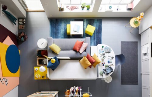
How to Choose a Color Palette for Interior Design
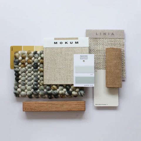
Standing in a paint store surrounded by hundreds of swatches is genuinely overwhelming, and it’s exactly why so many people default to safe, boring white walls out of sheer decision fatigue. Building a proper interior design color palette doesn’t need to be complicated — it just needs a clear starting point.
I used to change my mind on wall colors constantly until I started with a completely different approach — picking the palette from something I already loved, rather than starting from a blank paint chip wall.
Start With One Anchor Piece You Love
Quick answer: The easiest way to build an interior design color palette is to start with one item you already love — a rug, artwork, or fabric — and pull 2-3 complementary colors directly from it, rather than choosing paint colors in isolation.
This single shift genuinely changed how confident I felt about every color decision that followed.
Follow the 60-30-10 Rule
This classic design principle keeps a palette balanced rather than chaotic:
- 60% dominant color: usually walls and large furniture
- 30% secondary color: rugs, curtains, accent furniture
- 10% accent color: cushions, art, small decor pieces
Consider the Room’s Natural Light
Quick answer: Rooms with limited natural light generally look better with warmer, lighter tones, while rooms flooded with sunlight can handle deeper, more saturated colors without feeling closed in or heavy.
Always test paint swatches on the actual wall at different times of day before committing — the same color can look completely different under morning versus evening light.
Think About Flow Between Connected Rooms
If your home has an open layout or visible sightlines between rooms, the color palette should feel cohesive across those connected spaces, even if each room isn’t identical in shade. Jarring, unrelated colors between adjoining rooms create visual chaos.
Don’t Ignore Undertones
Paint colors carry subtle undertones — a “white” can lean warm yellow or cool blue depending on its specific formulation, and this affects how it pairs with your existing furniture and flooring. [link to related guide about paint finish guide here]
Use a Color Wheel for Complementary Pairings
Basic color theory genuinely helps here. Complementary colors (opposite on the wheel) create energy and contrast, while analogous colors (next to each other) create a calmer, more harmonious feel — pick based on the mood you actually want for that specific room.
Test Before Committing to a Full Room
Paint large sample swatches directly on the wall, not just small cards, and observe them across a full day before finalizing. Colors genuinely shift dramatically under different lighting conditions throughout the day.
Keep Personal Preference in the Mix
Design “rules” matter, but so does genuinely liking the space you live in every day. If a color technically breaks a design principle but you love it, that’s a valid enough reason to choose it anyway.
FAQs
How many colors should a room’s palette actually include? Generally 3-4 colors works well, following something close to the 60-30-10 balance for cohesion.
Should every room in my house share the same color palette? Not necessarily identical, but a cohesive overall theme across connected spaces creates better visual flow.
Do dark colors always make a room feel smaller? Not always — in a well-lit room, dark colors can feel cozy and intentional rather than cramped.
How do I know if a white paint is too warm or too cool for my space? Check the paint’s undertone on the label, and test it against your existing flooring and furniture before committing.
Is it okay to follow trends rather than timeless color choices? Yes, especially for accent walls or easily changeable elements like cushions, where updating later is simple and low-cost.
Final Thoughts
Building a confident interior design color palette really comes down to starting with something you already love, respecting the room’s natural light, and testing before fully committing. Don’t get paralyzed by too many options at the paint store. Pick your anchor piece, pull your colors from it, and trust the process from there.